Is Microsoft serious about its online media stores?
Movies & TV
Let’s say you want to buy an episode of Rick & Morty. This is what you get if you use the Microsoft store:
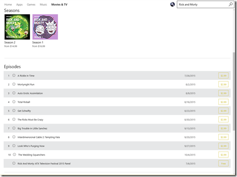
No previews. No star ratings. Not even movies get a star rating. The little “i” brings up a barely formatted tooltip. How did this even ship?
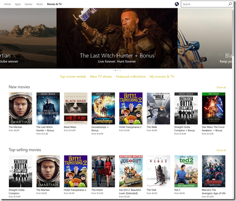
This is what the home page looks like:
Music
Going over to music the situation is better. You get a few highlights and you quickly get to the top sellers as a LIST.
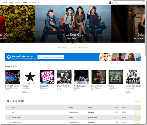
If you click on a song you can preview it. Better.
But what does it lack? Once again, no ratings and no popularity concept that lets you know that this particular song is the one that everyone’s referring to.
Games
In the games section you are treated with yet another UI. I want to emphasize that each of these screenshots represents going to a different tab in the same Store app.
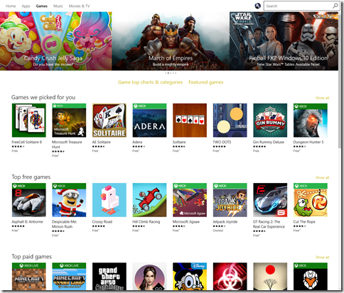
So now they have picked games out for me. I suspect they picked the same games for you too. So now they’ve discovered ratings which is a nice start. So the games section of their store does seem to be decently made UI wise. If you click on a game you get to see reviews, related items, and lots of other useful info.
Apps
Click on apps and you are treated to yet another layout. Remember, this isn’t supposed to be some web page. I am running their “store app”. Imagine using the Android store or iOS store and having the layout and features drastically change like this.
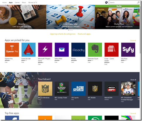
The selected app page is identical to the selected game page which is to say it’s pretty good.
You can definitely tell that the Apps and Games part of the store is more mature than the others. That said, there’s no excuse for Microsoft allowing their user experience for the media content to be in this kind of shape in a shipping product.
Apple’s Turn
This isn’t to imply that Apple has it nailed either. Their music, TV and movies app suffers similar layout inconsistencies. But here’s the thing, they make it very easy to get to the top charts, they have ratings, they have samples.
Here’s what their TV show equivalent looks like:
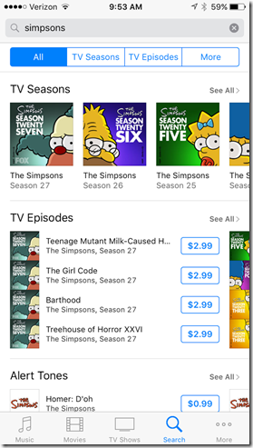
Compare that to:

On the Windows store if you click on the little “i” you get something like this:

No preview. as basic as it gets.
Here’s what it looks like on iOS:
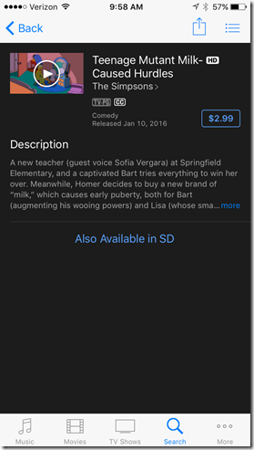
You can watch a prevoew of it. It has an actual layout. It’s just more polished in every way.
It’s baffling that Microsoft would invest so much in an area that they clearly have set themselves for failiure. They have a great product with the Surface Pro and the upcoming Surface Phone could woo people away. Except, of course, who wants to migrate to this awful media ecosystem?
For now, I’ll happily use my Surface Pro as my go-to mobile device but I don’t see myself buying any media for it.

