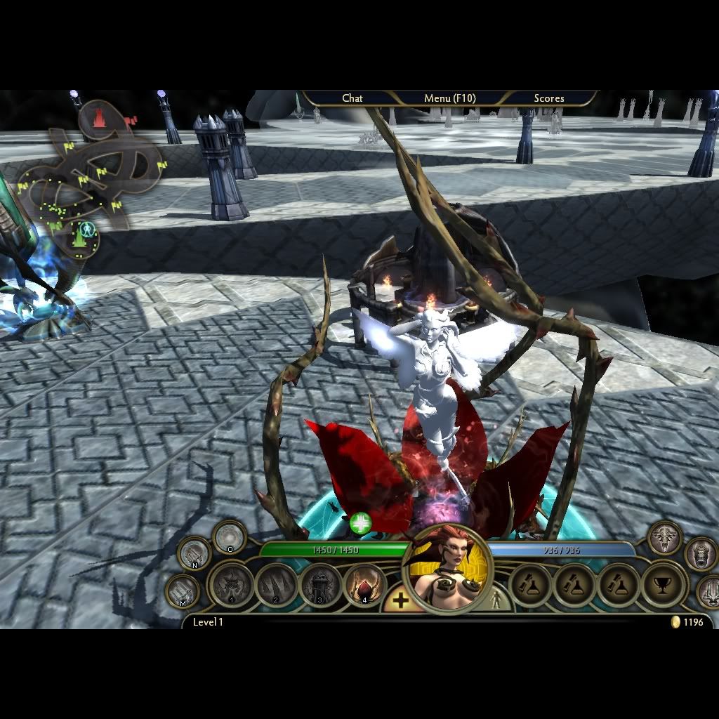
Attempting to fix the coloration problems.
Trial one revealed that the specTeam.dds was causing more problems than I had thought. The following is a revision of the above with a different wing pattern, darker skin, and darker eyes. Notice that the highlights on the hair are off the chart.
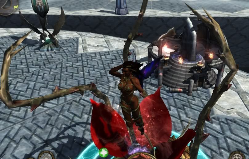
The skin tone is better, but the hair is really bad and the eyes are still odd. (This is with high visuals).
For a demonstration I took the queenTeamSpec.dds and decomposed it into the 3 different RGB streams.
(I'm borrowing the text from the DDS albedo link for the descriptions here)
green = SPECULARITY and GLOSSINESS seems to be BOTH specularity (how much color (white usually) the shine matches it's source) and glossiness (how HIGH and TIGHT or how small the reflected light spot and crisp it's edges) and they are not able to be controlled separately which is ok since they usually go hand and hand.
Notice the green on the hair.
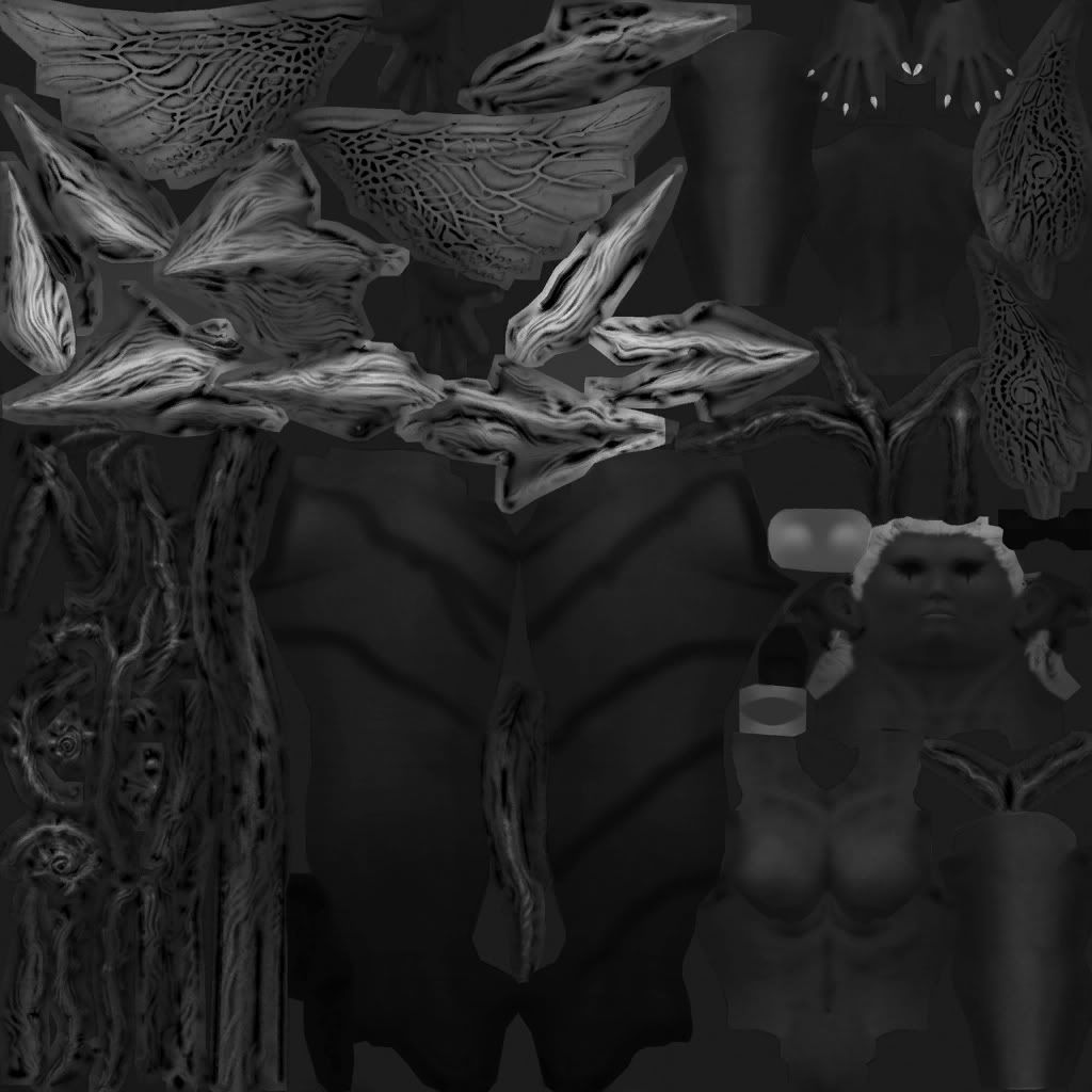
red = reflection - adding red makes the surface reflect (think aeon)
This will be highlights, notice the edges of objects.

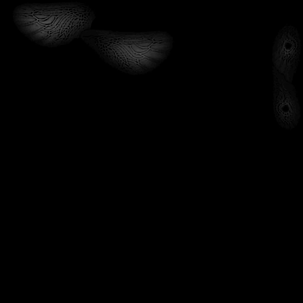
blue = bloom glow white (adds the nice glowing effect if you have bloom glow render on) this channel is much much more sensitive than the others, at a value of around 40, the effect is at 100%, if you want a more subtle glow use very small #'s like 10-25.
This is the glow that comes from the wings. The glow also combines with the aura glow from the map, which is why I'm switching to exile to give a more neutral white tone to my pictures.
Another interesting comparison is what happens when we give the engine a completely black and white albedo to use this specTeam.dds on.
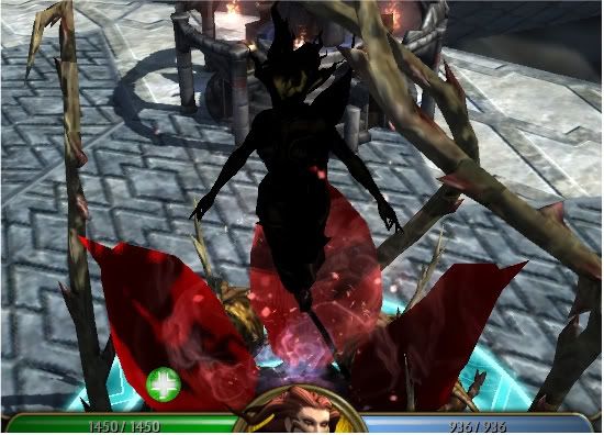
The black was interesting. The highlights on the hair and on the edges of her features really stand out.
The white is actually superb, and I think I want to include it as a skin as is, or with a little modification.
