So, I´ve done some pics of how some UI improvements could look like. most of them i did in a very short time, so the quality isn´t the best, but you should get the idea!
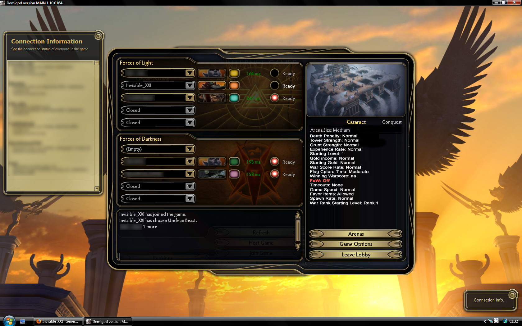
1. Game Options in the Custom Games Lobby

- i just dragged the buttons on the right a bit down.
- if you need more space you could even add a scrollbar on the right.
- Non-Standard settings are written in red to make changes visible in under 1 second.
as you can see, there is plenty of space there. maybe you could even add something usefull there 
(the text should be put in a table, of course)
2. End Game Buttons

that one should not need any comment, but the first button. this one should put you in the same custom game (with same map, options, players).
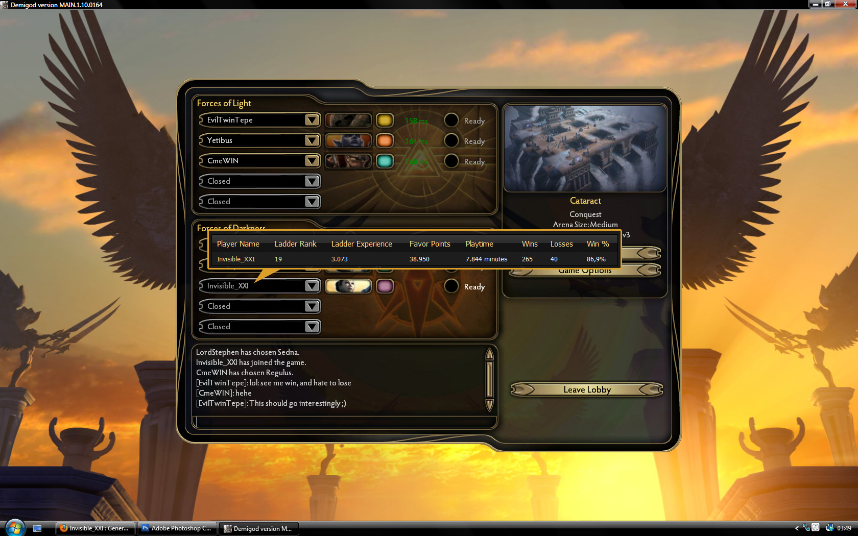
3. Statistics in Custom Game Lobby:

maybe you could just link this to the pantheon page...
a small popup if you mouseover a playername.
4. Chat/Teamchat while loading a map

although loading times are pretty short, this one would help in pantheon, especially if players are dropping and the map loads some time.
teamchat would be nice to give instructions or see what characters the other ones have chosen. etc pp
maybe there should be a button to switch from normal chat to teamchat. this could be usefull in the normal custom game chat, too.
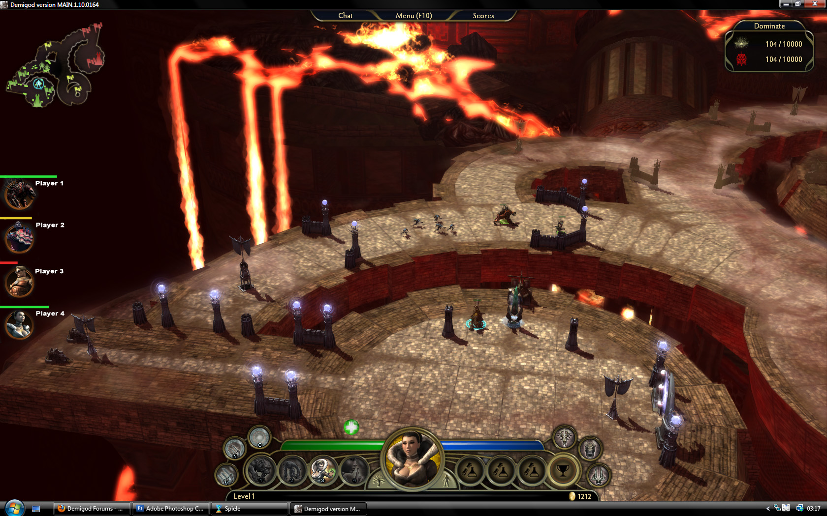
5. Ingame team-menu

That one is the most important: all your teammates in a menu on the left, with healthbar, player name and the option to cast spells on your teammates by clicking on their characters´ faces.
maybe you could add a menu-tab in the options, where you can select how to display this menu and where 


